Help Sections
Navigation Controls
Navigation controls is used for changing the viewing extent of the map; the datagrid updates accordingly to what's viewable in the current extent.
Usage

Map navigation controls
Click Pan North/South/East/West to move the map in that particular direction.
Click Canada View to view map at its full extent.
Click Zoom In/Out to change the map extent.
Click and drag the Zoom Slider to zoom in/out.Basemaps
The Basemap selector is used to modify the underlying basemap to provide a variety of geographical contexts.
Usage

Basemap selector widget
From the dropdown, select the basemap of your choice and the map display will update.
Get Link
Get Link is used to generate a shareable URL of the current map state with selected datasets.
Usage

Get Link widget
Short link
Select this link to use Google's URL shortening service to generate a concise and easily shareable link to the current state of the RAMP map viewer.
Email
Select this link to open a new email in your default mail client, with the URL contained in the body for convenient sharing.
Full Screen
Full Screen is used to collapse the departmental headers and footers to provide larger screen space for mapping.
Usage
Click the Full Screen button in the toolbar to hide departmental header and footer information. Select the Show Headers link to restore to default view.
Data Sets
The Datasets tab lists the layers available to display in the map. Feature layers also display in the data grid. The Datasets tab also serves as a map legend.
Usage
Layer Types

Data Sets
There are three types of layers that can reside in the Dataset tab.
- Feature layers represent data that can be interacted with on the map, and viewed in the data grid.
- Static layers provide additional geographical context against the basemap. They are not interactive and do not show in the data grid.
- WMS layers provide an overlay of data from a Web Map Service. They can support a click interaction on the map, and do not show in the data grid.
Layer Visibility
Select the "eye" icon next to a dataset name to toggle the layer on or off.
Layer Bounding Box
Use the "cross hatch" icon to the right of the eye icon to display the bounding box of the dataset.
Layer Reordering

Layer Reordering
Click and drag the 6 dots to the left of the dataset up or down to re-order the layers on the map interface.
While all layers can be re-ordered, WMS layers and Feature / Static layers may not be mixed together. WMS layers will always be displayed beneath the other layers, but may be re-ordered amongst other WMS layers.
Layer Metadata
Select the "Metadata" link to display relevant metadata for that source in a collapsible Info Panel.
Layer Settings
Select the "Settings" link to change layer's opacity using the slider control.
Summary Grid
The Summary Grid lists basic information for all the features that is visible in the current map extent.
Usage

The Summary Grid
Sorting
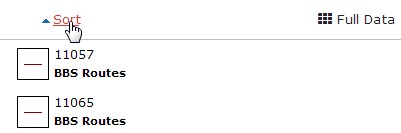
The Sort Button
Select the Sort link at the top of the data grid to sort by field name, descending. Select the Sort link again to switch the sort to ascending mode.
Details

The Details Button
Select the Details link next to each data row to display its information in an Info Panel. This function replicates clicking directly on a map feature.
Zoom To

The Zoom To Button
Every row on the data grid has an option to quickly zoom the map view to that data point. If the "Zoom To" link is clicked, the map and the data grid will dynamically zoom to that specific point.
Zoom Back

The Zoom Back Button
After the "Zoom To" link is clicked, the link will be replaced by a "Zoom Back" link. Clicking on the "Zoom Back" link will bring the user back to the extent of the map before the "Zoom To" link was clicked.
Pagination

The Pagination Control
Use the far left and right arrows to jump to the first or last page, respectively, of the information in the data grid. Use the inner left and right buttons to move back or forward one page at a time. Selecting the Page link will permit you to quickly jump to any page in the data grid listing.
There is also a record count next to the pagination buttons, which indicates the number of features currently in the map extent versus the total number of features in the map.
Extended Grid
The Extended Grid lists detailed information about all the features that in the current map extent.
Usage

The Extended Grid
Full Data Button

The Extended Grid Button
Select the "Full Data" button at the top right corner of the Summary Grid to show the Extended Grid.
Data Summary Button

The Data Summary Button
Select the "Data Summary" button at the top right corner of the Extended Grid to go back to the Summary Grid view.
Sorting

The Sorting Button
For any column, selecting the upward arrow will sort the extended grid in ascending order by that column, selecting the downward arrow will sort the grid in descending order by that column.
Details

The Details Button
Select the Details link next to each data row to display its information in an Info Panel.
Pagination

The Pagination Controls
Use the far left and right arrows to jump to the first or last page, respectively, of the information in the data grid. Use the inner left and right buttons to move back or forward one page at a time. Selecting the Page link will permit you to quickly jump to any page in the data grid listing.
There is also a record count next to the pagination buttons, which indicates the number of features currently in the map extent versus the total number of features in the map.
Info Panel
The Info Panel displays data associated with a selected feature.
Usage

The Info Panel
Select a feature on the map interface, or select the Details link in the Data Grid. The Info Panel will display information related to the selected feature. Clicking away from the feature or clicking the arrow in the top left corner of the panel will hide the display.
Accessibility
This page is WCAG 2.0 AA compliant.
Keyboard Accessibility
Keyboard functionality is provided as an alternative for users who are unable to use a mouse. Use the Tab key to navigate forward to links and controls on the page. Press Shift+Tab to go back one step. Use the Enter or Spacebar keys to activate links and controls.
Navigation Controls
Zoom Slider: With the Zoom Slider highlighted, use the Up arrow key to zoom in and the Down arrow key to zoom out.
Datasets/Data Tabs
With either the Datasets or Data tab highlighted, use the Left and Right arrow keys to switch between them.
Datasets Tab
Within the Datasets tab, use the Up and Down arrow keys to navigate to different layers. With the layer handle (6 dots icon) highlighted, use Enter or Spacebar to grab the layer. Grabbed layers are indicated with a dark blue background. With the layer grabbed, use the Up or Down arrow keys to re-order the layers on the map interface. Press Enter or Spacebar again to release the layer.
Advanced Toolbar
The advanced toolbar provides utilities that can break accessibility, usually due to their dependance on a mouse-driven input.
Usage
Opening the Toolbar

The Toolbar Button
Select the Advanced button on the main toolbar to open the advanced toolbar. Selecting the button a second time will close the advanced toolbar and de-activate any active tools.
Tool Activation

The Advanced Toolbar
Any tool can be activated by clicking the appropriate button on the advanced toolbar. Clicking a second time will de-activate the tool, as will closing the advanced toolbar, or selecting a new tool.
Population Tool

Population Polygon and Result
Select the Population button to activate the population tool. Draw a polygon on the map and release the mouse. The population of people inside the polygon will be displayed in the results window. The Clear button will erase an existing result from the map.
Buffer Tool

Buffer Input and Result
Select the Buffer button to activate the buffer tool. Enter a desired buffer size in kilometers in the tool input. Draw a polygon on the map and release the mouse. A buffer of the desired size will be applied to the polygon and displayed.
Measure Tool

Measurement Polygon and Result
Select the Measure button to activate the tool. Draw a polygon on the map and release the mouse. The area and the circumference of the polygon will be displayed in the results window.
Load Times / Unanticipated Behaviour
Load times may vary based on network location and bandwidth availability, and unanticipated behaviour may occur if any map interactions occur before data is fully loaded. Please allow the webpage to load completely before triggering any map functions.
Note
If the "Loading..." text appears in the lower right corner of map or the data grid displays a loading message, please allow the loading indicator to disappear before triggering any function on the map.
Datasets
Data
- Date modified: