Template Overview
Work in progress
This page is a work in progress and requires review. Please file an issue if information or coding is missing, incorrect or out of sync with the main repository (ramp-pcar/ramp-pcar).
Below is all the modules that are customizable through templating. This summarizes all the information the developers need in order to customize each module through templating. For details on how templating works, refer to this guide. For an example of modifying a module through templating, refer to this guide.
Header Description
- Description
- A description of what the template modifies
- Template Name
- The path in the JSON configuration file containing the name of the template. Each new line denotes the next child in the path.
- Template File
- The template file containing the template, all files reside in the “RAMP/modules/templates” folder
- Data object
- A description of the data object (o.data) that gets passed into the template
Basemap Selector
Each row in the basemap selector dropdown.
Default Behaviour
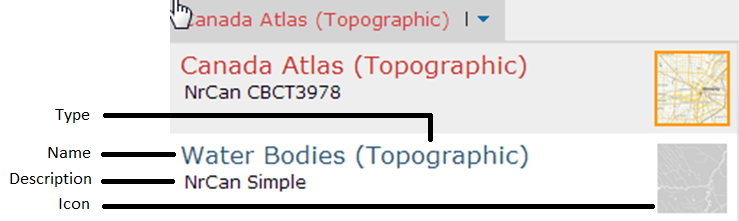
The default basemap row contains the name of the basemap, its type in parentheses, the description and an icon.
The default template uses the URL in basemaps[].thumbnail for the image icon, the basemaps[].name for the basemap name, basemaps[].type for the basemap type, and basemaps[].description for the description. The user can feel free to add more fields to the basemaps[] entry if their template requires it.
| Template Name | siteTemplate.basemapTemplate |
| Template File | basemap_selector_template.json |
| Data Object | config.basemaps[] |
Datagrid Summary Mode
Each row in the datagrid when the datagrid is in the summary mode.
Default Behaviour
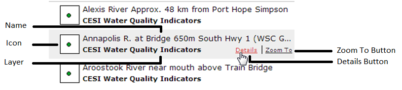
In the default datagrid summary mode, each row contains an image representing the feature on the map, the name of the feature, the layer the feature belongs to, as well as a “details” and “zoom to” button.
The image URL is retrieved using the getGraphicIcon function in templateUtils, which is available to the template via o.fn. The feature name is retrieved using the getFeatureName function. The layer name is populated using the featureLayers[].displayName, which can be accessed via o.lyr.
| Template Name | featureLayers[].templates.summary |
| Template File | datagrid_template.json |
| Data Object | The ESRI Graphic object associated with that point |
Datagrid Expanded Mode
Each row in the datagrid when the datagrid is the expanded mode
Default Behaviour
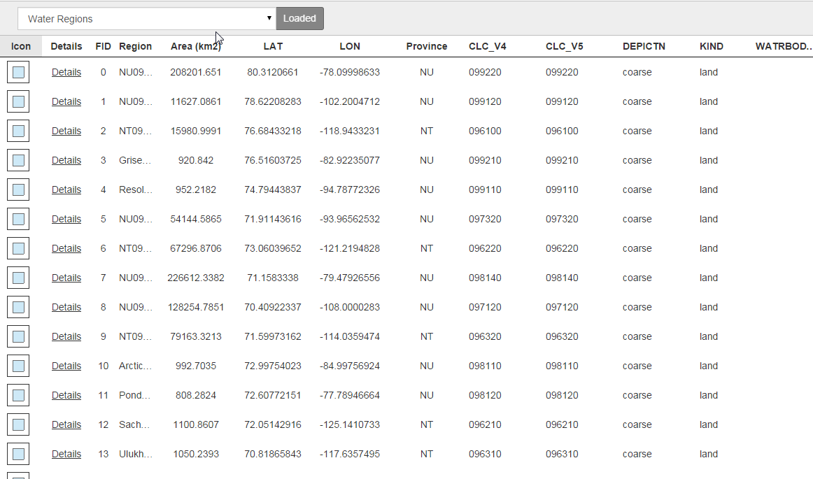
The default extended datagrid only allows the user to view one layer’s dataset at a time. The user can change layers using the dataset dropdown menu. The extended grid represent each feature on the map by a row in the datagrid. Each column uses a different template, and therefore can display virtually anything the developer wishes the user to see, for example: a simple data field, an image, or a link. The template that is used is specified by the columnTemplate field in the config. The data object passed into each column template will be the same, except for the “columnIdx” field which will indicate the column index (zero-based).
| Template Name | config.featureLayers[].datagrid.gridColumns[].columnTemplate |
| Template File | extended_datagrid_template.json |
| Data Object | The ESRI Graphic object associated with that point, along with an added field “columnIdx” that indicates the column index (zero-based). |
Feature Anchor Tip
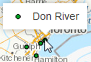
The popup that appears when a feature on the map is clicked.
Default Behaviour
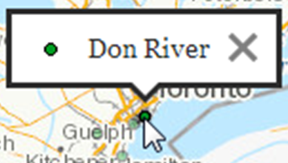
The anchor tip contains the icon representing the feature, the name of the feature, and a close button. The icon is retrieved using getGraphicIcon function in templateUtils, which is available to the template via o.fn. The feature name is retrieved using the getFeatureName function.
| Template Name | featureLayers[].templates.anchor |
| Template File | feature_anchortip_template.json |
| Data Object | The ESRI Graphic object associated with that point |
Feature Hover Tip
The popup that appears when the mouse hovers over a feature on the map.
Default Behaviour
The hover tip contains the icon representing the feature and the name of the feature. The icon is retrieved using getGraphicIcon function in templateUtils, which is available to the template via o.fn. The feature name is retrieved using the getFeatureName function.
| Template Name | layers.feature[].templates.hover |
| Template File | feature_hovertip_template.json |
| Data Object | The ESRI Graphic object associated with that point |
Feature Details Panel
The content of the detail panel that slides out whenever a user clicks on a feature on the map or selects a feature from the datagrid.
Default Behaviour
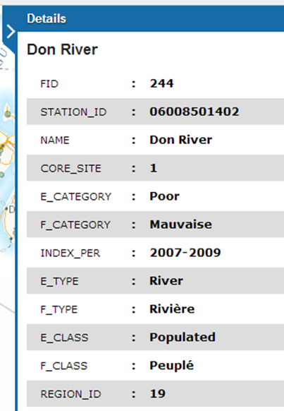
The default detail panel contains each field of the feature on a separate row with an alternating “zebra-pattern”. The default template iterates through each field in the feature and generates a list item for each field. The “zebra-pattern” is achieved by adding the class “wet-boew-zebra alterwg” to the list. The Wet Template would look for lists labelled with such class and style it accordingly.
| Template Name | featureLayers[].templates.detail |
| Template File | feature_details_template.json |
| Data Object | The ESRI Graphic object associated with that point |
Filter Global Row
The top row that contain the global layer and bounding box toggles
Default Behaviour

The default filter global row shows “All Data” and a global “eye” and “box” toggle for turning on/off all the layers or all the bounding boxes. The text displayed can be changed by changing config.globalFilter.txtAllData, the data used to configure the checkboxes is contained in config.globalFilter.toggleLabel[].
| Template Name | siteTemplate.filterGlobalRowTemplate |
| Template File | filter_manager_template.json |
| Data Object | config.globalFilter |
Filter Row
Each row in the filter manager
Default Behaviour
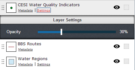
The default filter row contain a handle that enables the user to rearrange the order of the layers on the map, an icon representing the layer, the name of the layer, a metadata button that allows the user open a subpanel to view the metadata in that layer, a settings button that allows the user to adjust layer’s opacity if enabled in the config, and an “eye” and “box” toggle box that enables the user to toggle the layer visibility and layer bounding box visibility respectively.
| Template Name | siteTemplate.filterRowTemplate |
| Template File | filter_manager_template.json |
| Data Object | Custom |
Advanced Tools
Describes the input/output box for advanced tools.
Default Behaviour
Each tool has its own template. Templates are simplistic, showing output, or if required, an input box for tool parameters.
| Template Name | in custom tool, function displayOutput will call baseclass function displayTemplateOutput, passing in a template name. |
| Template File | Tools\templates\tools_template.json |
| Data Object | Custom |
- Date modified: